Copenhagen Major 2024 Sticker Review by Arko Digital

Intro
Opinion piece by Arko Digital.
The stackable nature of the stickers is a fantastic addition to the game, and it makes sense that after adding this mechanic to the game, Valve would implement it as the primary point of interest for the Major stickers.
With the advent of 5-sticker crafts and stacking though, there is a larger issue looming: lack of ability to "complete" crafts, and the implementation of Stack Deployment.
But before going further into that part, let’s look into the new team stickers for the Copenhagen CS2 Major.
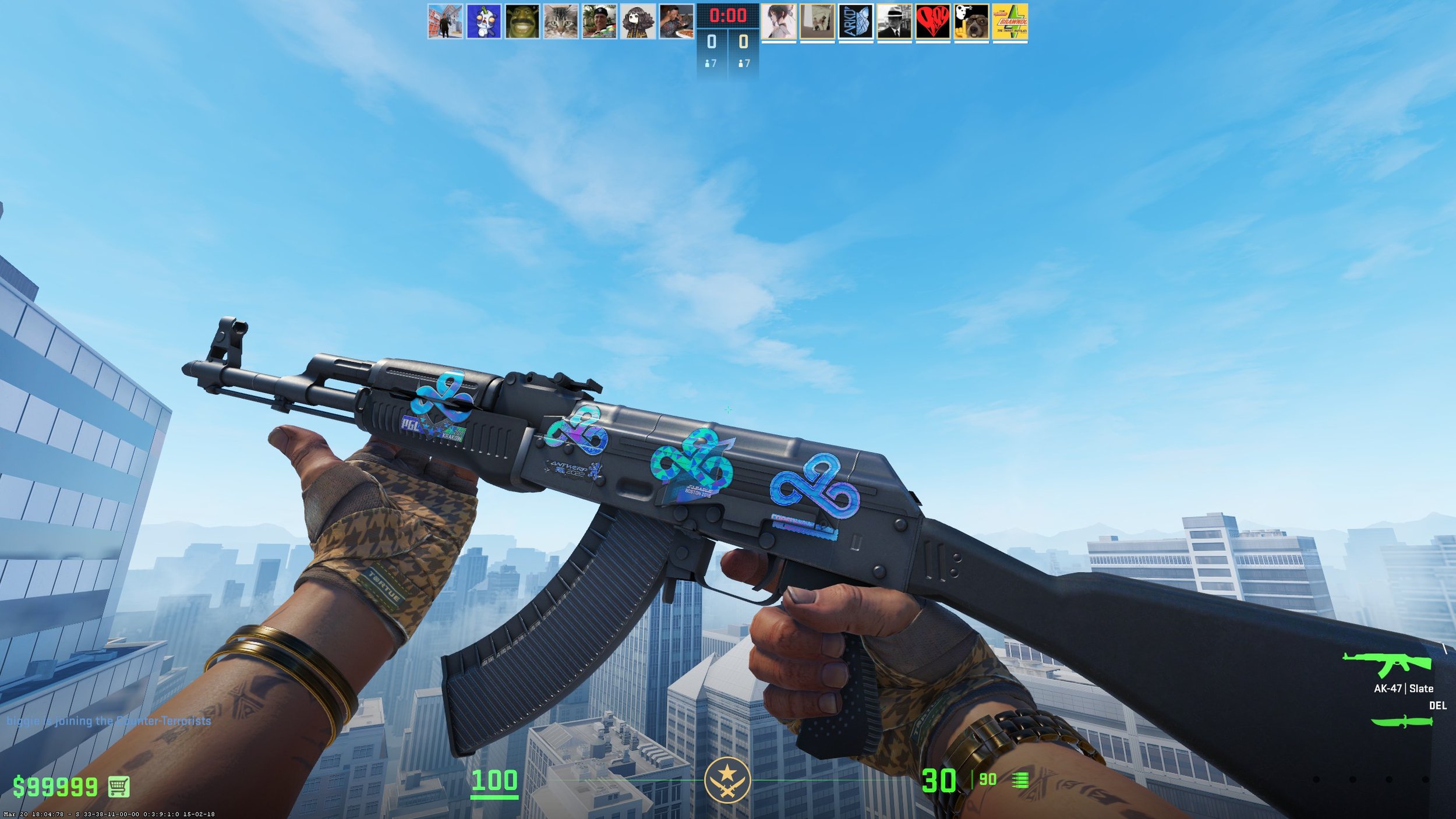
Paper stickers
We start off with the paper stickers. They're fine. They're neither better nor worse in my opinion than other backgroundless Major stickers.
Krakow may stand forever as the best paper stickers/signatures.
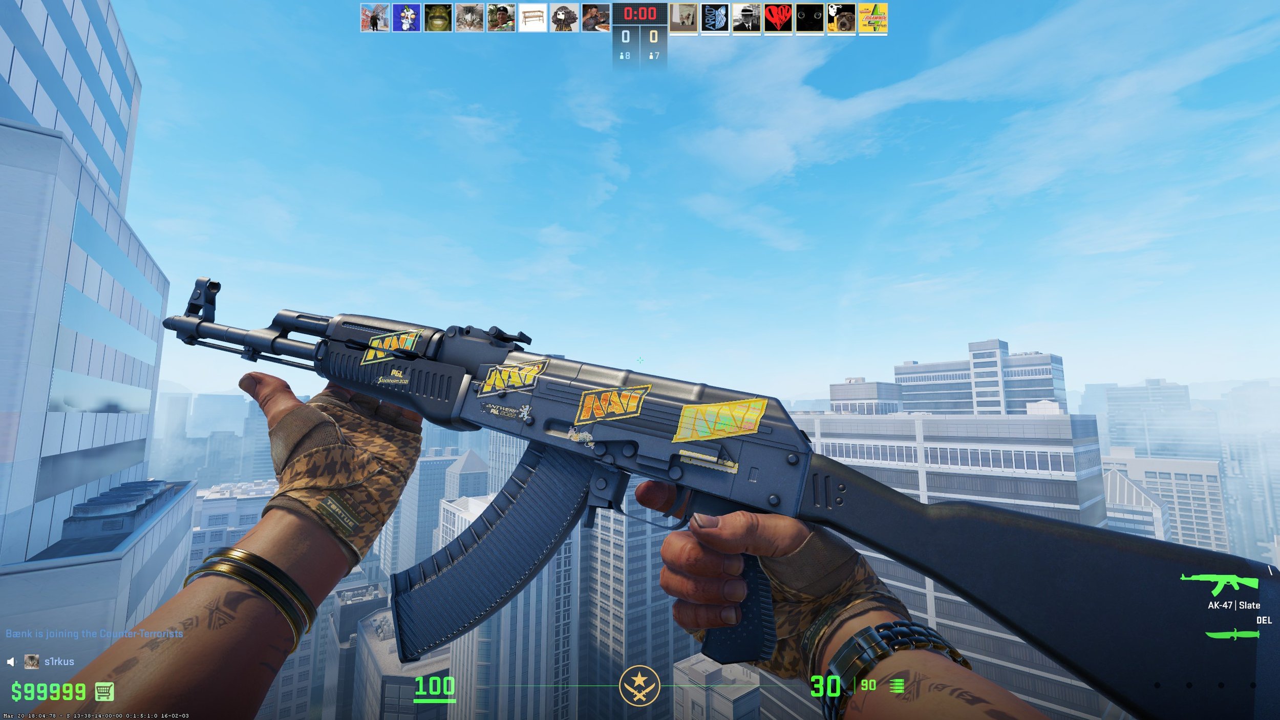
The Glitter stickers
The new Glitter texture has a much more pronounced offset in how it reacts to light, i.e. parts that are lit up are more shiny and noticeable than in the original Glitter texture. This is extremely noticeable in dimly lit areas of the map as you rotate.
The Glitters that have variance in glitter color (VP/G2) will be more sought after since - especially for stacks - they bring a lot of brilliance and shimmer.
The single color Glitters (Mouz/FaZe/Koi) that are only different shades of red or blue lack the variance and do not improve the stack as much. The shapes used in the new glitters are an odd choice: reminiscent of children's playschool glitter, where a more CS themed set of shapes could have been used, or just varying geometric shapes. The crescent moon and star have not hit me right yet, but perhaps that'll change.

The Holo stickers
The Holos are clearly meant to be stacked with other stickers in several cases where the "logo" of the team is the only slightly holographic, and the "outline" is the true holo portion in the standard sense.
Teams like Imperial have a barely noticeable effect in game and could easily be mistaken for Paper stickers, which significantly reduces value, especially when placed next to their old stickers. The instances where the holos have the "logo" as the holographic portion are much more likely to be valued by the community (Furia/Na'Vi/VP) for their standalone properties, as well as stacking potential.
Certain instances where the Glitters have high variance will complement the outline Holo stickers (G2), but are primarily color dependent. The Faze and Mouz combos are full red and only gain so much brilliance, whereas the G2 combo becomes a shimmering rainbow of Epileptic horror.

The Gold Stickers
Gold stickers remain on the downtrend since Stockholm. They lack brilliance, definition, and the 3D aesthetic that Stockholm did so well. Antwerp was fine, Rio brought a welcomed Gold change in my opinion, forcing the black background/contrast. Paris removed almost all depth from the stickers, and Copenhagen didn't find fit to change this trend.

When stacked with glitters, the golds CAN look good, but again it is dependent on the colors' mixture. Virtus Pro Glit-Golds look and behave nicely and may be well worth the use of 2 crafting spaces, whereas the Imperial turns the gold slightly green. It's okay and while the effect is nice it doesn't come across as well as other glit-gold combos.
Experimentation is needed for these stickers to find the best combos. Value will follow those discoveries.
A Looming Issue
When the 5x crafting option came out, the overwhelming thoughts that I saw from the community was "ok that's cool, thanks". We have been deciding 5th best pos for weapons, and coming up with unique designs. With the release of Major stickers, coming up with the standard Team or holo crafts is going to become a problem.
If Valve wants to give us stacks as the MAIN draw for these stickers, we are no longer able to even do the old standard 4x crafts with them. Having 4x G2 Glit-Holos would be fantastic, but we're stuck with 2x+1 instead.
The Solution?
The solution I've come up with is to deploy Stack Crafting where we could select 2 (or more) stickers to use in a single slot, thus relieving two issues. It would allow players to create a full mono-themed craft, without necessitating 10 spaces to do it. With so many spaces, you could write Homer's The Iliad across the skin (or more importantly: truly obscene sentences).
Stack crafting also ensures perfect alignment. I would be remiss to not say that I think Valve DOES have an update in the works for this, but as always neither you nor I know anything about it.
Team Dispersion
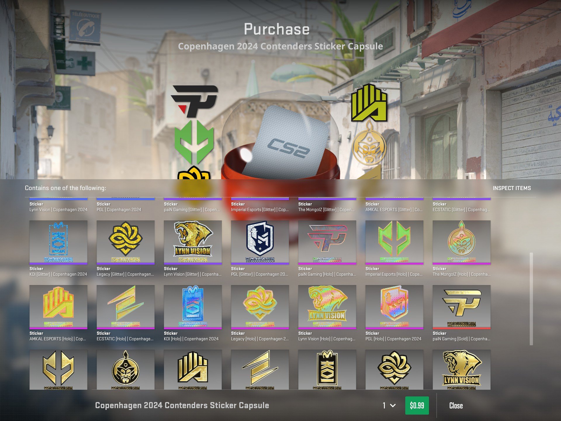
As noted in one of my previous tweets, the Contender's Capsule has the same aesthetic across 5 different stickers (pictured).
At no fault of Valve's were these the teams that qualified for the major, nor is it their fault for them all having the same base color. Amkal, Ecstatic, Mongolz, and Lynn Vision Holos could very easily be mistaken for each other at first glance given their similarity in color, and hololgraphic effects/coloring (see below picture).
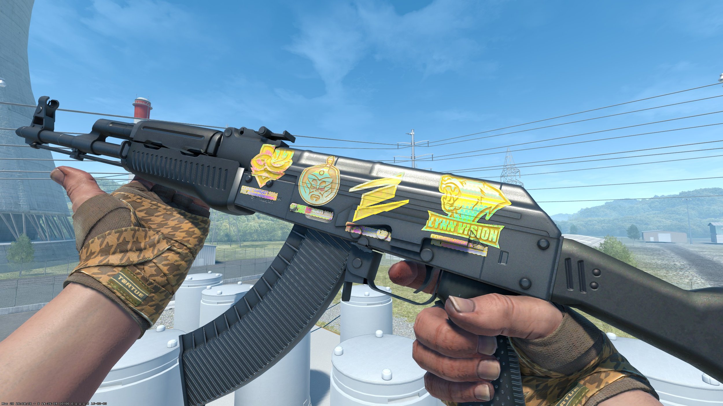
To be precise, most are using the exact same holographic spectrum. It's also very apparent when viewing the capsule in game. One thing to note is that as the "sticker money" talk becomes more and more popular amongst teams, analysts, and the community alike, acknowledging the need for better designs will become a necessity for professional teams. If making the major can be worth life changing money, it needs to be WORTH the life changing money - meaning that teams need to make logos and color schemes that investors and the community alike will spend their money.
Lynn Vision will be highly sought after by the Chinese market for many reasons, but there's untapped potential in their logo for the simple fact that they included the giant LYNN VISION at the bottom of it. Excluding their name, and bringing a better color palette to the game could have substantially increased their profits from people trying to hit their holos, which is a much more cost-friendly endeavor for western capsule openers than only chasing the Gold.
Of course, numbers will not be released for a while, and I could be entirely wrong, but as a capsule enjoyer I will not be opening many Contender's capsules when the only 3 stickers I would be chasing are the Koi holo, Pain holo, and Lynn Vision gold. The Legends capsule has a much better chance of turning profit from my initial thoughts, thus allowing me to keep opening capsules.
My Overall Opinion
Good update, good stickers, but unless we get stack deployment it will fall short of its intention.
I'm excited to see the new combos as the community has time to showcase all of them.
Teams need to think harder about the logos they're submitting. Also un-noted, players need to understand the significance of their signature and spend time on it instead of outsourcing their work and producing lacklustre results when forced to redraw (please to God use a thick Sharpie instead of a ballpoint pen).
-Arko Digital
Conclusion
We hope you enjoyed Arko’s review and his thoughts above the new Copenhagen Major stickers. Make sure to give him a follow over on Twitter: Arko Digital Also, you can check out his different creations on his Steam workshop, here.